


 Firstly, I open up my original rough sketch of my choice in Illustrator and named it PENCIL SKETCH layer and lock it up to ease the work.
 Next, I open up 2 new layer, one named as LAND and the other named as CITY. On both layers, I used PEN TOOL to draw the outline of the city buildings and land. I set the stroke of the brush to 3pt so that the lines would be more visible and easier to work with.
 Then, I copy the image of my tree in assignment 2 and paste it in a new layer which I named it as TREE and make some alterations to the size of the tree so that the whole proportions of the posters become more balance.
 For the next step, Itried to create a morning sky. So, I open a new layer and named it as SKY, and I fill the sky with color by using LIVE PAINT BUCKET TOOL, and add some GRADIENT to it. I mix dark blue, cream yellow, and soft orange for the sky. Then to avoid the color appeared to be too opaque, I reduce the OPACITY of this layer to 75% to create soft light effect.
 Same as the SKY layer, I used LIVE PAINT BUCKET TOOL to fill in color for the LAND layer. I add some GRADIENT to the color so that the overall color won't look so dull. I change the characteristic of the gradient to Linear and rotate the angle of the gradient to 90 degrees.
Using the same technique as above, I fill in black for the buildings of the CITY layer. Then, I move the whole layer below the LAND layer to create distance feeling between the city and the land.

Then by making the TREE layer visible, I just do some slight alterations to the position of the tree to the centre of the poster.

Next, I open a new layer and name it as FIREFLY. Using the same technique to create the fireflies in assignment 2, which is using Ellipse tool to draw many circles, fill it with mix orange GRADIENT effect and use GAUSSIAN BLUR to blur them. The only difference from assignment 2 is the color I used to mix for the GRADIENT which is to be fill into the circles is a 2 or 3 more level lighter than the orange color I used in previous assignment ,the sizes of the fireflies is much more smaller as compare to assignment 2 so that it won't take away the attention of the TREE which is the main character in my poster.

Next, on the SLOGAN layer, using ARTISTIC PAINTBRUSH, I select dark green color as the stroke to draw a young plant and write the words 'tree' to make the elements TREE appear differently from the others to accentuate it as the main message of my poster.

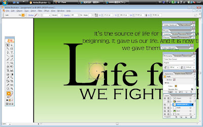
Next, to insert words for the slogan, I used TEXT tool to draw a text box and type in the slogan I design and change the font size of the words by using big font size and bold for the main message appear LARGER and more eyecatching and the smaller message into smaller font size.

This is how the the SLOGAN layer looks like after all the editing I've done to it.
Next, I try to copy one of the firefly from the FIREFLY layer and paste it between the L and the I of the word LIFE to enlighten the whole effect of the slogan. I found out that the outcome is really quite nice, and I like the way the firefly brings out the feelings of HOPE for the words LIFE and hence I decided to keep it there.

Last but not the least, I create a new layer and name it as LOGO and paste my symbol in assignment 1 on the left corner of the poster. It's like a copyright, symbolize that it is my creation...hehe...

Here is how my project looks like in the end. yay!!!!

0 comments:
Post a Comment